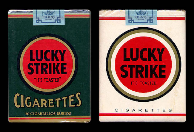
In the spring of 1940 the president of American Tobacco, George Washington Hill, walked into the office of renowned industrial designer Raymond Lowey and set a pack of Lucky Strike cigarettes on his desk. “Someone told me that you could design a better pack,” Hill says, “and I don’t believe it.” Hill bet Lowey $50,000.00 ($845,000.00 in 2017 dollars) that he couldn’t do it. Lowey, known for his work with Studebaker, Exxon and Coca-Cola, accepted the challenge.
Lowey focused on three areas – he simplified the overall typography, enlarged the Lucky Strike logo and altered the colors. By switching the predominantly green pack to white the product became more appealing to the ever-growing number of female smokers, who now saw a fresher, less masculine looking package. When it comes to using color, marketers follow a simple yet important distinction between the sexes. Generally speaking, men like bright colors and women pastels. And men gravitate to shades of color (where black is added to a pigment) while women perfer tints of color (where white is added to pigments). Males found the bright red circle of the revised Lucky Strike pack pleasing, while females were drawn to its overall lightness and sophistication.
The redesigned cigarette pack went to market and was an immediate success. Sometimes small adjustments can make a big difference. In this case, Lowey’s insights and recommendations on color produced striking results. And Hill, true to his word, paid off the bet in full.