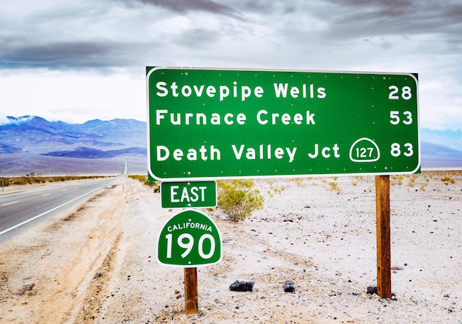
The next time you're on a highway take a closer look at the information signs you see during your drive. There is a logical rationale for the different coloured backgrounds on these signs. Those with urgent messages employ brighter colours – for example: red for stop, orange for construction and yellow for warnings. Green signs with white lettering impart directional messages – exits, mileage and mile markers. Blue signs indicate restaurants and rest stops, while brown signs flag areas of outdoor recreation.
Bright colours, such as red, orange and yellow, stand out against the landscape and direct our attention quickly. Whereas earth tones, such as green, blue and brown, are common in nature and signs using these colours are less intrusive to drivers – hence their association with non-urgent messaging. More importantly, white type on each of these three coloured backgrounds reads very clearly at night. The contrast between the colours and the white lettering actually make the message appear to be larger.
When the automobile was first introduced to North America there was no standard for road signage. It was not until 1935 that one was established. The Manual on Uniform Traffic Control Devices outlined specifications for sign shapes, colours and typography – setting the foundation for the highway signs we see today.
