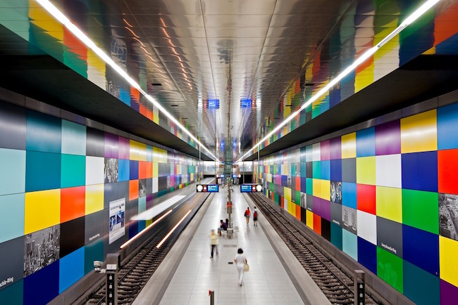
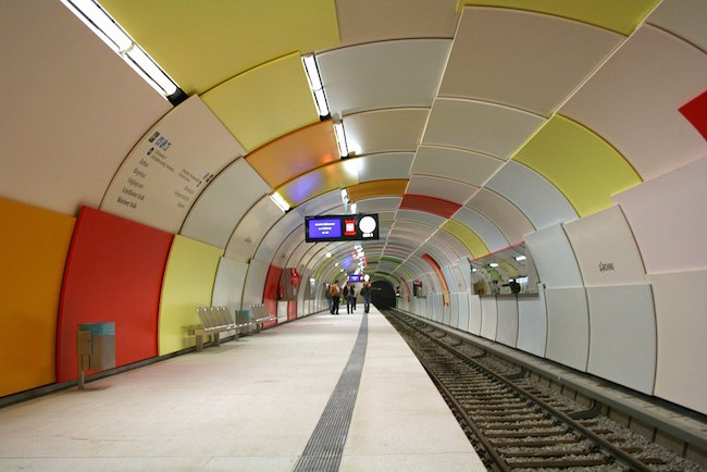
Playing off the name of Germany’s famous highway – the Autobahn, Munich’s transit system is known as the U-Bahn (Underground Highway). It was up and running a year prior to the Munich Olympic games in 1972. Since that time, its original sterile design has evolved into one of the most progressive transit systems in the world – interior design wise. In the 1980s, Munich’s subway planning committee made a commitment to improving the rider’s experience on the U-Bahn through design and colour. “The use of artistic elements should help make a passenger’s wait more pleasant, something that cannot be said for subterranean, mostly artificially lit, spaces,” said committee member Rolf Schirmer.
Colour plays a big part in defining the personalities of many of U-Bahn’s stations. Designers and artists have incorporated large coloured tiles, glass panels and vibrant spectrums into their plans. Combined with innovative LED lighting, the colours bring life to the underground, transforming the ominous spaces into other-worldly environments. Transportation systems, be they airports, railways or public transit, have always been concerned with wait times for passengers. Countdown clocks, information monitors and live performers have proven to be among the more successful solutions to address the problem. The U-Bahn and other major transit systems throughout the world are learning that colour, and its impact on human emotions, can be a cost-effective alternative.


