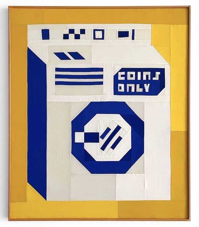
Jefferey Sincich / Artist
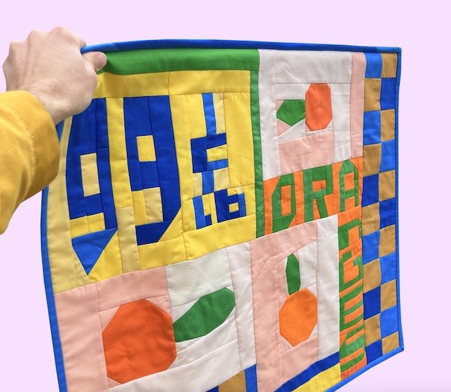
Here’s a fresh take on the art of quilting. Los Angeles-based artist Sincich creates his whimsical pieces inspired from retail signs and advertising.
2. Harrild & Sons / Typography
A page from the catalogue Specimens of Wood Letter published in the U.K. in 1906. Among the many samples in the book are pages of illustrative two colour fonts like the one shown here.
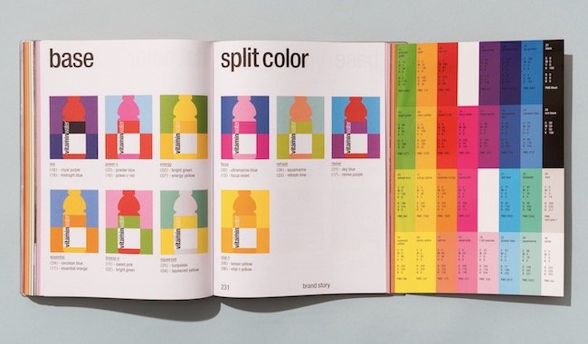
3. Collins Design / Vitamin Water
A comprehensive graphic standards guide was developed by Collins Design to launch the new brand system for Vitamin Water. The brandbook is just as lively as their outdoor advertising.
4. Paperwood / Product Development
This innovative product sandwiches coloured paper between thin sheets of wood to form an exciting alternative to plywood. Unfortunately, it appears to have very limited distribution.
5. Azuma Makoto / Floral Sculptor
Japanese floral artist, Azuma Makoto, creates “botanical sculptures” by coating his arrangements with water and allowing them to gradually freeze. Watch him create the piece you see here.
6. Lego / Advertising
You realize just how brilliant this ad is when you learn your looking at a family portrait of the Simpsons. It was created years ago by German agency Jung von Matt. See more examples of ads that capitalize on a brand’s strong colour profile.
6. Crayola Doesn’t Make a Color For Your Eyes / Song
I stumbled across this clever song while researching colours one day. Do yourself a favour and give it a listen. In 2007, Kristin Andreassen won the John Lennon Songwriting Contest in the Children’s Category for this song.
8. Yinka Ilora / Objects
This multi-talented designer from the U.K. helps fill the world with sunshine by sharing his colourful view of life. We all need one of his umbrellas! See the wide range of his work here.
9. Le Corbusier / Architectural Colour System
In 1931, Le Corbusier developed “Architectural Polychromy” – a system of 63 harmonious colours for architects to incorporate into their projects. See all of the colours here.
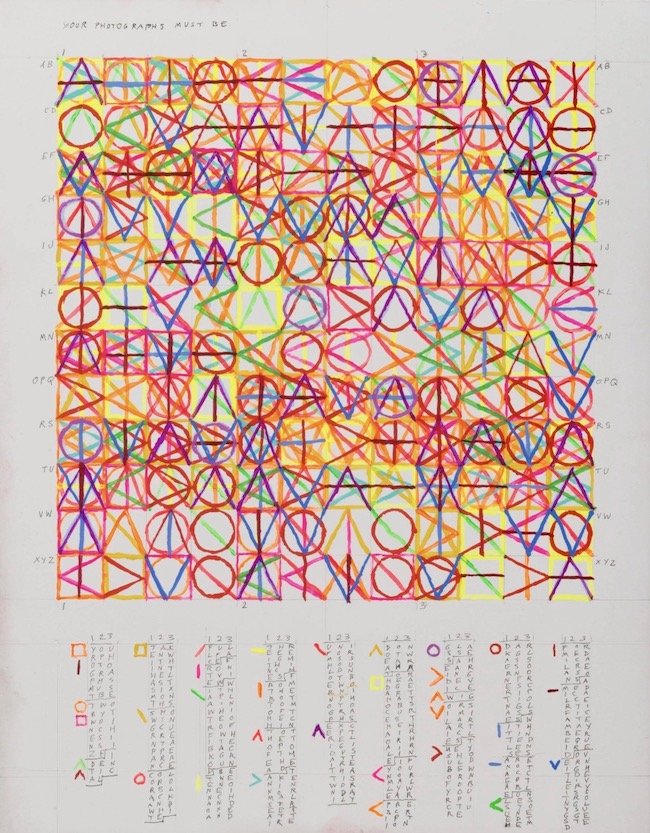
10. Leslie Roberts / Artist
Leslie’s work uses words sourced from signs, emails, news reports, etc. to formulate patterns. Her geometric abstractions make for remarkably unique expressions of colour.


